Office Building Markas
St. Pölten, Austria
Since 1985, Markas, a family run business, provides high quality innovative facility services. The company built a new office for 30 employees in an industrial area of the Spatzern district in St. Pölten.
The project reflects the services Markus provides, as well as the philosophy of the firm, based on a non-hierarchical organisation. The key aspect was to focus on the development of a closed system with great indoor qualities: a hortus conclusus, in order to create a high-quality working environment, despite the anonymous surroundings.
Placing the building on columns solved the classical dilemma between the necessary parking spaces for the employees and the space needed for the firm. It was therefore possible to not only create a covered parking lot, but also to develop a maximum building density for the site, with a high quality working place with panoramic views. The landscape floats unhindered through the building due to its elevation, creating a flowing space between the parking elements and natural elements. The two inner courtyards developing their potential as rising green islands, becoming part of the indoor space.
The office space of 1000m2 reflects the corporate identity of a family business.
This non-hierarchal organisation offers concentrated working spaces around an informal open communication space. Everyone works on the same floor with a linear communication flow. The two inner courtyards create an atmosphere of well-being. The building typology generates a circular and a central circulation. The advantages are: an excellent orientation, a good view and short routes with ideal interconnections within the building. Varying speeds of movement are possible within the building: fast, during the work process thanks to several shortcuts, slower, to improve the communication flow during the work breaks. The central communication areas are located on the junction of the two systems. The two inner courtyards and the four „cuts“ offer a visual connection to the outside and a better orientation.
The glass, chosen as the main material for the façade, becomes the symbol of the company for cleaning and facility services.
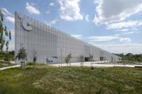
The pixilation of the facade and materials used erase the scale of the building, providing a complex and diverse interaction with the perception of the building and its context. The building is camouflaged during the day mirroring its surroundings. At night, the precisely fitted windows, designed for the rear end offices and their need for light, become transparent. The transparent panels turn out to be the closed panels and the dark ones turn out to be the actual transparent ones. The pixilation of the facade is based on a five-step system of different glass transparencies. The transparencies range between a matt non-reflecting glass panel, to a fully reflecting surface. The surrounding views are reproduced as fragments on the facade like coloured pixels, creating an ever-changing surface design depending on time of day and weather. It is used in only glass remains, in all its facettes.
Inside the building, the opposite impression occurs – the wooden window frames show specific extracts of the surroundings. The walls create a feeling of security, focusing the attention on the inner open space, the inner courtyards and the generous spatial impression.
The material used for the park deck structure is dark on purpose. Through to the dark plaster facade the volume seems to be monolithic and generates a unity with the black asphalt.
From a technical point of view the project is very innovative and eco. The heating and cooling of the office building results from the ground water heat pump. The building is classified as low-energy (A<25kwh/m² a).


