Residential House with Atelier
Wißgoldingen, Germany
Experiments in Place of Conventions – It isn’t that long ago that life on the Swabian Alb was difficult. Even if it is hardly longer so, it can still be read in some names. There are rises which are called ‘Kaltes Feld’ (cold field) or barren plains like ‘Härtesfeld’ (harsh field) which got its name from its stony earth. Today the Swabian Alb fascinates by often breathtaking landscapes, vast views, jagged cliffs and large caves belonging to widely branched out underground systems.
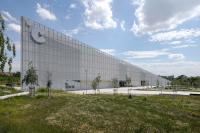
From Schwäbisch Gmünd, in the eastern foreland of the Alb, a road leads - as if on a ladder to heaven - uphill, past Rechberg to Wißgolding where the landscape opens up towards the south. Here – on a southwest slope – C18 Architects built a residential house with a studio for the jewellery designer Georg Spreng and his family. Towards the street the building is closed; it attracts attention with its cladding of white square tiles. The buildings cubic shape also distinguishes it from its neighbours. Even if the house is closed towards the street, it doesn’t close itself to the neighbours. A tower room with a window facing the street positions the building in the neighbourhood. No fence hinders visitors from entering the premises and looking over a wall onto a pond in an open atrium and into the living area. At this point two entrances lay symmetrically to each side. They both have red emergency shutdown buttons as bell buttons. From this standing point one can already notice a considerable lot about this house; the way it entangles inside and outside and that it is a special house.
To understand the house one has to go inside. Inside the entrance area ones first impression is surprising. Large round skylights lighten the area from above and through an even larger round opening in the floor light reaches a lower level. The light flooding through the openings connects both levels with each other. A yellow bench nestles up to the balustrade. One thing is clear: the cliché of the architects or designer house isn’t going to be reproduced here. In the entrance area the floor, walls and built-in wardrobes are all white. One opens the wardrobe doors – they have no handles and open upon pressure – to find the inside is painted in a variety of colours. To the left the lower level is reached over a staircase which is painted in a deep violety blue, the bedrooms lay alongside. Straight on one reaches the studio which can also be reached directly from the outside by the second entrance. Georg Spreng’s idea was to combine work and living in one building; but he also wanted that each have their own separate areas. C18 Architects developed a layout which accomplishes this.
Two levels lay over one another like two U-shaped brackets. The upper bracket is open towards the street; the lower bracket is open towards the countryside. Through the resulting eyelet one can look down from the entrance area onto a pond in which lays a small island upon which a tree was planted. The tip of this tree can be seen from the upper level from the street. The lower bracket has shorter sides than the upper one so that the upper level projects over the lower level and roofs parts of the outdoor area. The necessary construction for the up to six meters long projections was statically an enormous challenge. To the left of these two brackets a row of rooms and bathrooms joins on. At the end of this the staircase is located over which the crow’s nest - already seen from outside - is reached.
All rooms on both levels are open to the southwest, to countryside with hardly any housing. One doesn’t only see fields and meadows but also the weather coming along.
Open rooms, a room-high glazing with thin profiles, spaces formed by changing floor levels over the whole width of the living area, spaces which lead into the landscape and also continue the landscape in the interior.
This is the first house that Georg Spreng – born in 1949 – has built for himself and his family. He became acquainted with the young architects from Stuttgart over their “Haus auf der Alb” (house on the Alb) which was completed 2006 in the immediate neighbourhood. The process of finding out how he wanted to live was very exciting for Georg Spreng. He had lived in Canada for a while and the experiences he made there were very important to him. In Canada Georg Spreng had lived on an estate which was so large one could loose ones way on it. He lived in a house in which – during according weather – proved how vulnerable humans are and how strong nature can be. From these experiences he developed an intense connection to nature.
This is why – with his own house - it was important for him to be able to build up an intense connection to the landscape und to let the house step in to the background. This as well as the way the architects fulfilled these wishes is the side of the house which makes out its fascination; the well thought out embedment in the landscape, the house as a tool to be able to feel the landscape and to be able to connect with it. But there is a second side to the house; Georg Spreng was originally an industrial designer, along with others he set up the group Frogdesign. He is interested in what materials can do and how people react to them and handle them. A dialog evolved between the architects and Georg Spreng over questions of detail. The dialog lead to unusual material combinations, to combinations which don’t follow established conventions. Material should be allowed to speak, be allowed to appeal to senses and feelings. Nowhere – not even towards the street - plastered paths or flat terraces can be found; instead there is crude gravel like normally found on the bed of a mountain river. The curtains are made of a silvery shiny material which was developed to cover scaffolding on construction sites. In the living area the back wall against the ground was constructed by stamping layer over layer of clay. Some of the layers are pigmented lightly so that a picture emerges which resembles a view over the Alb with foggy valleys. The architects knew to take advantage of their client’s openness and use it playfully.
The house is an experimenting field. Expectations and anything matter of course are questioned. Conventions of living as well as architectural conventions “how things have always been done” were abandoned. But a game wouldn’t be a game if it weren’t taken seriously. None of the tiles on the facades were cut. The large mirrors which cover the walls on the garden level between living area and atrium are each out of one piece. The wooden floor made out of Canadian birch is high-quality processed. The wall plaster has a high percentage of clay which works - like the stamped clay wall - humidity regulating. The room-high glazing with its extremely thin profiles is the first of its kind with these dimensions. The balustrade around the skylight in the entrance area is rounded in such a way that it feels good to touch but nothing is laid on top. Everything has a reason; is considered and intended, even if one wouldn’t have thought of the solution by oneself.
C18 Architects have designed an exceptional house. A house which gives you lust, makes you lust for living and lust for the countryside. And as unconventional as it may be in the neighbourhood - it fits in. It is a known fact that it’s not easy to pull the wool over the eyes of people from the Alb. Life was too hard to risk relying on somebody else without question.
Christian Holl
- Architects
- kaestle&ocker
- Location
- Wißgoldingen, Germany
- Year
- 2008
- Client
- privat
- Team
- kaestle ocker roeder (C18 Architekten): Andreas Ocker, Michel Roeder


