Three Aoyama
Tokyo, Japan
The neutrality in the centre of Tokyo
Usually, commercial buildings are expressed in a way that is far from neutral. Because they are appointed as the spokesmen for the company’s products, therefore the design supposed to be hyperactive in order to stand out from competitors. Due to the mutual competition among neighbors, especially in the heart of dense commercial area, this “pressure” of design becomes so obvious that we nearly have to cover our ears to get rid of it. The residents of the city would probably like to protect themselves from such pressure they live with by squeezing or shutting down their senses unconsciously.
On the other hand, the client is a natural cosmetic brand who aims for non-artificial beauty achieved by the restoration of people’s vigor through physical and mental relaxation from various stress. The concept, which the client pursues, is “neutral”.
Accordingly, the motif of the project became the substantiation of a “neutral space” that was capable of leading its users to open their minds and hug the world.
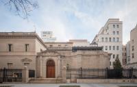
First of all, we decided to use almost 30% area as a blank pocket park, or “unbuilt area”, which located in the corner of the site on the street in order to decrease the urban pressure. Then we oriented each shop facing that “urban blank” to acquire an environment which further stands back from the stress. The design, consisted of three floating L-shaped cement slabs, was extremely concise as well on the ground of our concerns to suppress the unnecessary “voice” of design.
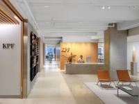
In addition to the building, we also designed the internal spaces of three shops for the sake of their alignment with the concept. As an opposition to the superficial “loud” design, the full employment of “pure material” whose skin remains the same as its core was the way how we dealt with the interior. In concrete, what we used were “coral travertine” which also served as the ingredients for the brand’s products, “Hanchiku” made up of soil used to parent all the lives, and raw hunks of “Japanese Buna (Beech)” picturing an ever green forest. Besides, instead of ornamental finishing, it is large masses of these three materials that we used here as we attempted to reveal an abstruse and high-resolution world of nature rather than one full of superficial icons.
By reducing pressure of our design almost to zero, it became possible for us to feel this micro yet abundant world. And when we reviewed it at urban scale,


