Mitsui Outlet Park – Kisarazu (Phase 3)
Chiba, Japan
Japan's No.1 Outlet Mall with a Wide Variety of Greenery
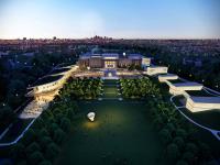
Mitsui Outlet Park Kisarazu reopened in October 2018 after renovation with additional floor space and now boasts the largest number of stores of all outlet malls in Japan. In continuation to the main area, STGK has undertaken the landscape design for the expansion area. This time, the overall concept was “garden resort”, creating a relaxing environment amidst lush greenery for the visitors to enjoy shopping. The expansion area is divided into the “Mall Area,” including the entrance and the walkways connecting the stores, and the “Garden Terrace,” which provides visitors a place to rest and relax. Each area provides different ways to interact and enjoy the greenery.
In the Mall Area, the walkways that connect the stores feature furniture that are designed to bring people closer to the greenery, and color scheme that compliment the greenery. This is so that visitors can always feel connected to nature while shopping. The entrance leading from the parking lot to the stores has an island resort-like atmosphere with an abundance of tropical plants such as coco palms and Taiwan crepe myrtles, further enhancing the feeling of excitement before shopping.
In the Garden Terrace, visitors can take a break from shopping or enjoy seasonal events while surrounded by gardens of vibrant plants they would not normally encounter in everyday life. In collaboration with garden planner Yuichi Tsukada, we worked together on the entire process from conceptualization to design details. The site is long and narrow in the east-west direction and divided into two zones, the “East Garden” and the “West Garden.” Each is built with different concepts. The East Garden is designed with “Mountain,” “Light,” and “Yang” as keywords to create a linear spatial composition and planting plan that conveys the strength of life. The West Garden, on the other hand, is designed with the words “Sea,” “Dark,” and “Ying” in mind, to convey the softness and suppleness of the plant life. These two zones exist as a dichotomy, and by moving back and forth between them, one can sense the circular flow of time such as the changing light of the day and the changing seasons.
- Landscape Architects
- STGK Inc. | studio gen kumagai
- Ubicación
- Kisarazu, Chiba, Japan
- Año
- 2018
- Cliente
- Mitsui Fudosan
- Design supervision (Garden Terrace)
- Yuichi Tsukada (Onshitsu)


